Introduction
This is a reworking of my session at BarCampLondon2. I started about 5 minutes late, which means I ended up zooming through the following links at a rate of about one per minute.
Historical
Charles Minard – Napolean’s Russian Campaign of 1812
This graphic, first published in 1861, contrasts the size of the French army on the attack and retreat parts of the campaign, and also compares the temperatures faced by the troops on the retreat.

Florence Nightingale’s Causes of Mortality in the Crimean War
This chart was used by Florence Nightingale to show the government the true causes of death during the Crimean war. The graph is not the clearest, but the blue area represents deaths through preventable disease, red is death through wounds and black is all other causes. Its fairly obvious what the main cause of deaths were.
Common
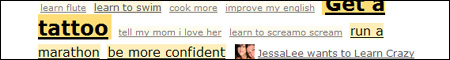
Weighted List
The weighted list is a fairly common technique. used on del.icio.us, flickr, and the example used here is from 43Things. The more popular an item is the larger it’s size is – this provides a quick and easy way to determine popularity.
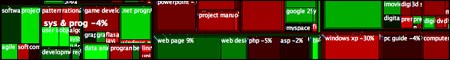
O’Reilly Treemaps
Tim O’Reilly uses Treemaps to analyse the ups and downs of the computer book industry. Treemaps display hierachical data using areas of comparable size, thus highlighting disproportionate areas and in this example enables easy comparison of shifts in the market place.

Newsmap
This interactive Flash application compares news articles sourced via Google News. Using brightness to indicate freshness, and colour to indicate grouping, the actual relative popularity of news stories can be seen.
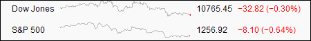
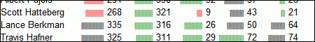
Sparklines
Not all data visualisations need to be complicated. Sparklines are a streamlined view of one set of changing data. The example here compares the performance of the stock market, other examples include things such as comparing winning and losing streaks for a sporting team.
Elections

US Election Results – Red vs Blue States
After the recent US election, maps appeared of ‘Blue’ vs ‘Red’ states – this site looks into greater detail the ways of representing this data displaying the influence of population, and the middle ground of purple, as opposed to pure Red and Blue.
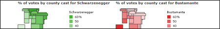
Californian Vote Distribution
This site applies some statistical normalisation to results of the Californian Gubernatorial elections and then reworks the map of California to draw insights from the original data.

UK Election Shift
This interactive Java applet shows the shifting of seats that occurred during the recent UK elections. Seats that have become more marginal shift away from the edges and gains and losses are represented by seats migrating into a different section entirely.
Travel

Travel Time Maps in the UK
In these sets of UK maps, coloured contour are are applied to represent the time taken to travel around the UK. Both train and car are contrasted, showing a slightly asymmetric map of travel times. Journeys within Cambridge and London are also displayed, highlighting comparatively unconnected areas of both cities.

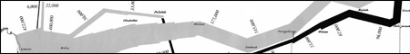
Travel Time Maps in Europe
These maps use map distortion to compare rail travel times in around Europe in 1993 and 2020.
World Data
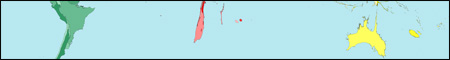
Worldmapper
Worldmapper applies changes to the size and shape of countries based on various data sets to produce distorted maps. Population, economic wealth, air passenger numbers are all vary easily compared across the world. They have produced nearly 300 maps so far, all of which are available in PDF poster format.

World Processor
World processor doesn’t constraint itself to size and shape – it applies images on top of the existing globe of the Earth, changes the topography or removes countries entirely. Not all the examples work well, but those that do highlight the usefulness of this technique.
Others

Data Fountain
The data fountain shows that not all visualisations need to be software. This installation contrasts the relative worth of the Yen, the Euro and US dollar with the height of their associated fountains.
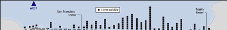
Suicides on Golden Gate Bridge
This infographic shows the reported jumping point for people committing suicides based upon witness and surveillance footage. People are more likely to jump facing San Francisco, than the Pacific Ocean, and light pole #69 is by far the most popular.

Quantum Level Particles
This page demonstrates some conceptual items for representing quantum particles, and their combinations and interactions. While it isn’t ideal, it is an interesting and different way at looking these things.

Circular Calendar
This poster size calendar is designed to be drawn upon. Events and journeys can be non-contiguously marked, and collisions in time can easily become highlighted.

Family Wheel
An interesting look at the family tree, this technique transforms branches into slices of a circle. It is, however, unlikely to be clearer when common ancestors are found.
Lightweight Data Visualisation in Excel
Not all data visualisations need to be complex. This technique for Excel creates easily comparable data using only conditional formatting and a simple command to repeat characters.

Multi-Touch Research
While not quite a visualisation method, this technology – coming soon in the new iPhone – looks to provide a real world interactive with data on screen. The video provided by this research group at NYU shows some quite amazing ways of working with information on the screen.
Resources

Tufte is a legend in the field of data visualisation and his books are well worth a read for anyone interested in this topic. He also runs courses on this subject, but unfortunately they seem to be US only.
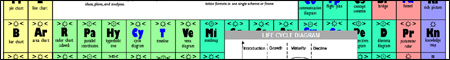
Periodic Table of Visualisation Methods
While this list is inherently flawed, due to its shoehorning of the Periodic table into comparing visualisation methods, it has some use however, in detailing a large number of techniques, both simple and advanced.
Blogs
information aesthetics and visualcomplexity
I didn’t get a chance to mention these in my talk, but I felt it worthwhile to include them here. Information Aesthetics is a site focused entirely on data visualisation and is a fantastic resource on the subject while VisualComplexity is focused more narrowed onto the domain of complex networks with over 400 examples of different representations.
Conclusion
I think this is a really interesting field of work, getting into the heart of what computers should be used for – making ideas and information clearer to the end user and providing insights which were not previously perceivable.
Feel free to comment below with any additional examples you have found, and without a doubt the visualisation category within my del.icio.us links will continue to grow.
Pingback: links for 2008-03-16 « Social Sim
Pingback: links for 2008-03-19 « Kathryn Corrick