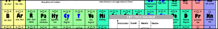
This is a tidying up of my presentation from BarCampBrighton2 over the weekend. The notes I used for my presentation were were pretty much just these URLs with some memory prompts for any points I wanted to raise.
Introduction
My introductory point was simple: data + understanding == information. For example, when you know that the character string 011000010100001001100011 is in ASCII you will see that the string is really aBc.
Cholera in London

Jeremy Keith brought this one up during the talk and I always forget this one so I thought I’d just slip it in sneakily anyway. This shows plots cholera outbreaks and water pumps on a central London map and pretty much proved the direct relationship between the two.
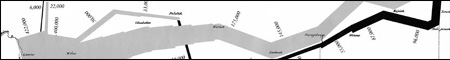
Charles Minead – Napoleon’s Attack on Russia 
Since the last talk there has been an article in the Economist talking about the history of infographics, and there is a much clearer version of this map available. This chart shows six separate pieces of information fairly concisely – geography, time, temperature, the course and direction of the army’s movement, and the number of troops remaining.
Florence Nightingale – Diagram of the Causes of Mortality in the Army of the East 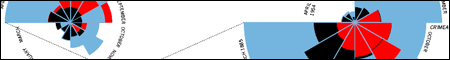
Similarly, Florence Nightingale’s chart was also referenced in the Economist article. It has been re-analysed by Henry Woodbury at Dynamic Diagrams and shown in different formats all based off the same data. It is interesting to notice how the choice of representation can influence the implied relationship of meaning. Sparkline
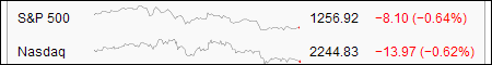
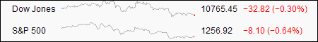
Another reprise from my BarCampLondon2 talk, Sparklines are a quick and easy way to compare changes in a single value over time. This particular grab is from the Wikipedia article, and provides a comparison between these two stock indexes.

This is a link discussion page for Sparklines, that also contains a couple of pages of the original concept as outlined in Edward Tufte’s book, Beautiful Evidence
Treemaps -Sequioa View

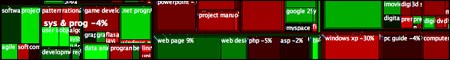
Treemaps were created by Ben Shneiderman as a way of discovering where the hard drive space on his server was being used. The size of the square indicates the size of the file – so a file several directories deep can still be noticed. This is a link to the Windows program SequioaView that can be used for the same task. O’Reilly’s State of the Computer Book Market  Every year the team at O’Reilly produce a report on the rise and fall of the computer book market, using Treemaps. Rises are indicated by green colours; falls by red colours; intensity indicates the strength of the rise or fall. It is really easy to see what the big winners and losers for the year are.
Smart Money Stockmarket
 A natural place for Treemaps to be used is in the stock market – this is a link to the first pretty one that I could find; the colour scheme is the same as the O’Reilly treemap.
Newsmap
 NewsMap is an interactive news browser that consumes GoogleNews. This is plotting the number of distinct news articles (size), the type of article (colour), and the age (brightness).
HistoryFlow
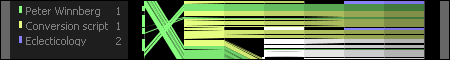 HistoryFlow is an innovative approach to analysing the history of edits of any Wikipedia page. Using this tool you can clearly examine the influence of various authors on a Wikipedia article, contrasting edits over time, and over the number of edits. It also clearly highlights exactly how pointless wiki-vandalism is.
MySociety: More Travel Maps
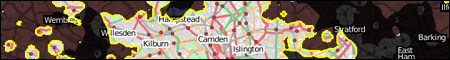 I talked about the MySociety travel maps at BarCampLondon2, and they’ve updated their travel maps since then. One of the updates is a really cool RIA-let that allows you to contrast travel times to the Department of Transport with London house prices.
State of the Union
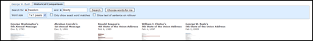
The State of the Union address is a good source to analyse for differences overtime. I couldn’t find the original webpage that I’d sourced, but in searching I found this one that is much better. This site allows you to compare the Union addresses, with particular keywords highlighted. You can compare speeches for key presidents going back to Abraham Lincoln. Unsurprisingly more modern presidents are a little more concerned with terrorism, although war does seem to be a constant.
GapMinder
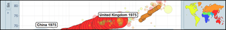
GapMinder is a great site powered by UnData.org. This RIA allows various statistics to be charted against each other, while highlighting specific countries and looking at the changes over time. When I first found this site, I spent nearly an hour playing around combining different statistics – during which time I noticed a bump when the contraceptive pill was introduced to the US, followed a few years later by a bump in the UK. Of course, an important thing to keep in mind is that correlation is not necessarily causation.
Photo Analysis
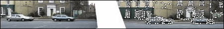 I found this article referenced in New Scientist a few years ago. It describes a process where the hidden unique information in a photograph – the arrangement of buildings – can be used to identify where in the world that picture was taken.
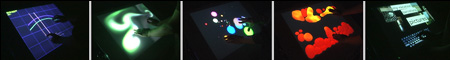
Aphex Twin – Windowlicker
 Richard D James is known for his weird electronic music and using his face as visual branding for his music. The music video for Windowlicker features a group of bikini clad models all wearing his face as a mask – but he has also hidden his face inside the music, visible only through the use of a spectrogram.
Year Zero
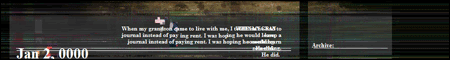
And finally, Year Zero. In conjunction with the new Nine Inch Nails album Year Zero, there was an Alternate Reality Game created by the team who made I Love Bees (a Halo promotion). Information for this game was hidden in all sorts of places – amongst others they include:
- the tour t-shirts had some characters that were slightly brighter than others, spelling out a URL (iamtryingtobelieve.com)
- inside USB keys left in toilets at concerts there is a mp3 of static showing a phone number (1-216-333-1810)
- the CD when heated shows a binary number leading to a URL (exterminal.net)
- and finally, towards the end of the song Another Version of the Truth the sound of static spells out in morse code yet another URL (gracetheteacher)


